
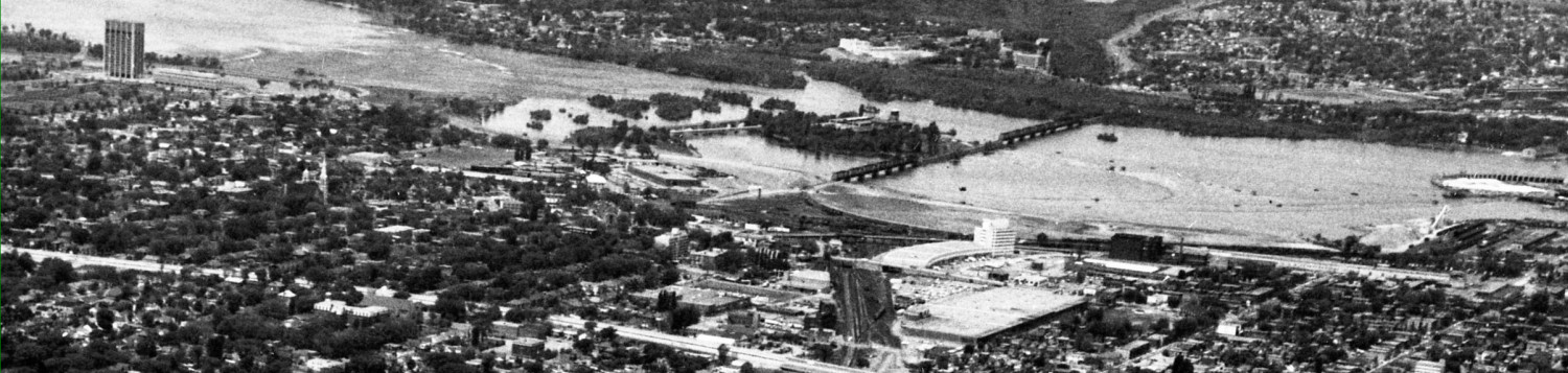

The City unveiled the final streetscaping plan for several blocks of Queen Street around the two downtown Confederation Line stations (Lyon, and Parliament).
One detail I noticed was the graphic logo for the Stations, consisting of a bright red circle (donut?) on a stick. Here’s the one at Lyon Station:

and another at Parliament Station by the old Zellers:

and again at the link between the two towers of the Clarica /Sunlife Centre:

Of course we need a graphic logo that can (eventually) instantly identify where the Station entrances are for locals and tourists alike.
On the existing transitway, the bright red steel tubes of the stations are distinctive and visible from a long distance. Now iconic, they work beautifully.
If that red O looks familiar, we have seen it before on Carling Avenue near the Carling OTrain Trillium line station. The Trillium line is mostly in a cut and thus invisible to the great majority of Ottawans who haven’t a clue where it is:

The red O is also shown on a banner and on the sign to the OTrain elevator lobby off to the right, above the invisible train track.
The red O also faintly reminiscent of the very famous London tube graphic, shown here in both its generic format and for a specific station:
![]()

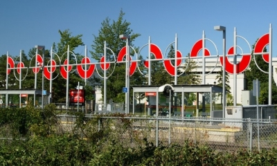
I am also reminded of Stuart Kinmond. Back in 2014 the City awarded him the contract for Carleton’s Trillium Line station art installation.
His piece, entitled Locomotion, seemed popular at the artwork competition open house. Many of us at the meeting suggested it would be a fine identifying logo to put at all OTrain Stations. The red circles lend themselves to repetitive rhythm, as at Carleton’s station, and could also be abbreviated to fewer circles at less-open locales.

Working through from the Queen Street solid red donut sign on a stick, to the London tube icon, to the Locomotion piece, there is a definite sense of better quality and more imaginative and sophisticated design.
I’m hoping the Queen Street reveal was a hint of what is to come, but that the logo itself will be further developed. They could start by hiring Kinmond to extend his Locomotion design.